

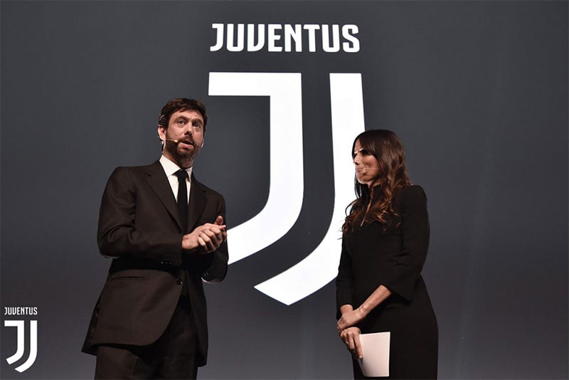
Italian footballing giants Juventus F.C. have recently revealed a new, stripped down logo, breaking with traditional badges & crests and moving towards a more modern design aesthetic. The project was handled by the Milan office of Interbrand.
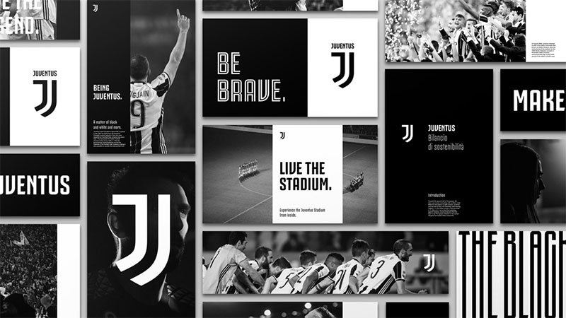
The new badge itself is just one part of a comprehensive rebrand. According to the agency behind the club’s new image “Juventus aims to distil its essence into far-reaching experiences which can appeal to the football fan while being highly relevant to entertainment enthusiasts who are further away from football as a sport. The new logo is iconic and universal. It’s bold enough to make a statement, but flexible enough to appear alongside a wide range of new experiences—in the stadium and beyond. By leaving the team’s defining black-and-white stripes untouched, Juventus is bringing the illustrious legacy and spirit of one of Italy’s preeminent teams to new audiences and die-hard fans alike.”
It’s pretty obvious from that press statement that Juventus doesn’t want to be just a football team anymore – it wants to be an entertainment brand. They no longer have a club badge but a company logo.
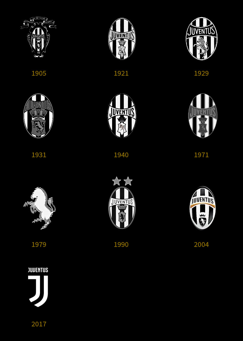
Predictably, and perhaps understandably, the reaction from some of the fans has been far from positive. As you can see below the club’s crest has looked basically the same for over a century (with only a brief departure in the late seventies and eighties), and with so much history and emotion connected to the old badge, it’s inevitable that the fans are going to be resistant to major change like this.
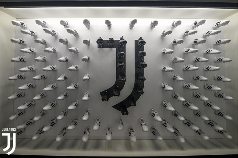
The new symbol actually works brilliantly as a logo – at least when you look at it purely from a design perspective. It’s simple, bold, memorable, easy to reproduce at different sizes and it will work great in all sorts of applications. It’s also extremely clever, combining the club’s trademark black & white stripes and the letter “J” and using them both to make a badge shape. And if it was just the logo of a new lifestyle company it would work fantastically well. The new kits haven’t been revealed yet, so whether or not the new look will be embraced by the fans remains to be seen.